

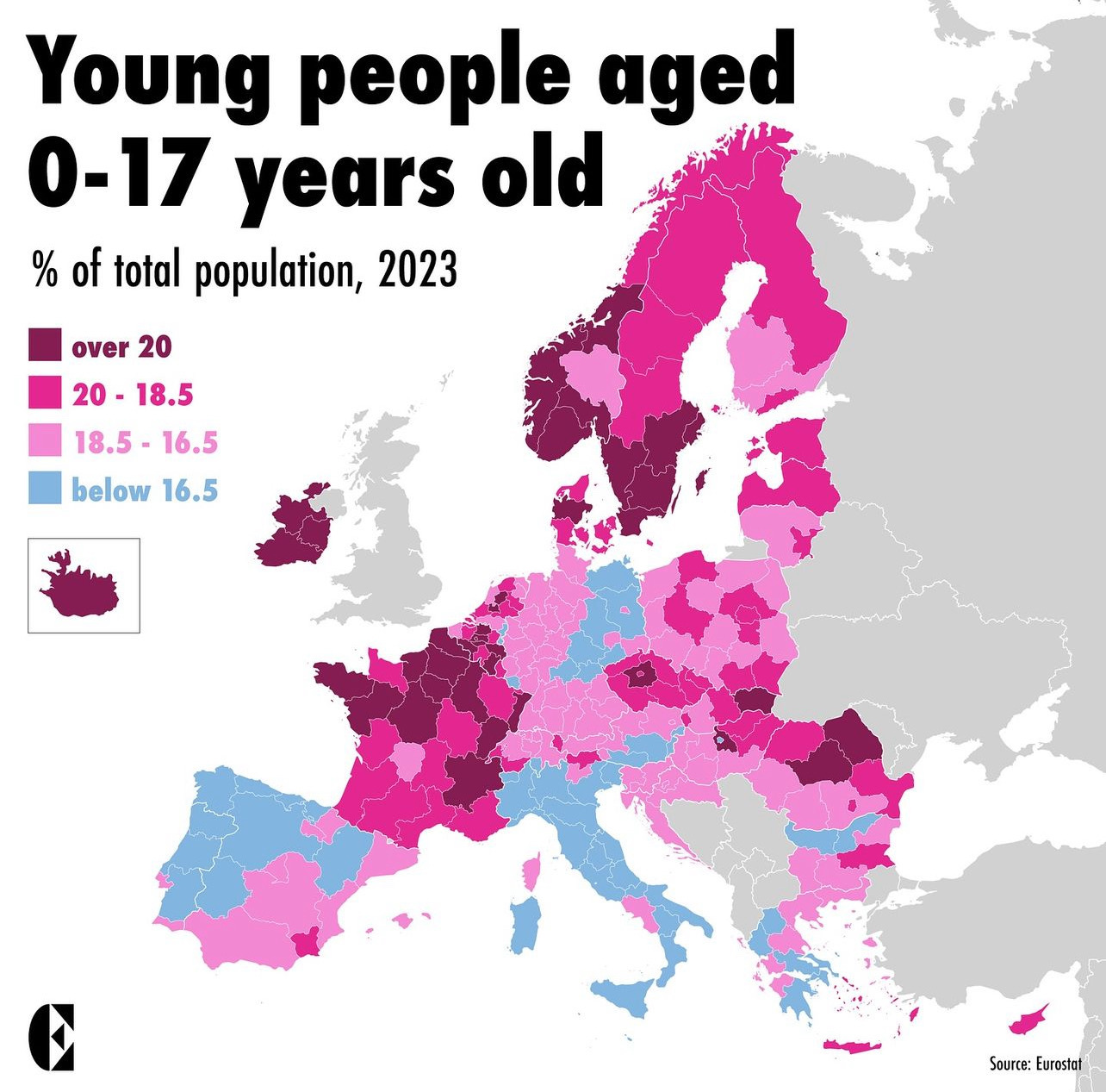
This map shows the percentage of the population aged 0-17 years. In order to be able to identify differences within countries, the map shows the differences at a regional level.
Source: Eurostat
Are you surprised how many or how few children there are in a region in Europe?
So is this a map of retirement migration? Social and economic security? Long winters?