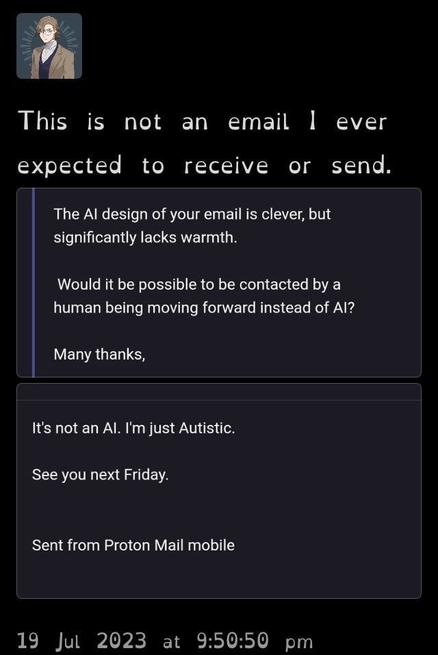
SomeoneElse@lemmy.worldM to Don’t You Know Who I Am?@lemmy.world · edit-22 years agoDon’t you know I’m not AI?lemmy.worldimagemessage-square78linkfedilinkarrow-up1423arrow-down11
arrow-up1422arrow-down1imageDon’t you know I’m not AI?lemmy.worldSomeoneElse@lemmy.worldM to Don’t You Know Who I Am?@lemmy.world · edit-22 years agomessage-square78linkfedilink
minus-squareLumidaub@feddit.delinkfedilinkEnglisharrow-up1arrow-down1·2 years agoIt can even help with attention-focussing issues like in ADHD. Marvelous invention, really.
minus-squareSwedneck@discuss.tchncs.delinkfedilinkEnglisharrow-up0·2 years agoIronically i find it vastly more difficult to focus on than normal fonts, all i want is to FUCKING MAKE GLYPHS LOOK DIFFERENT TO EACH OTHER iIlL| if these don’t look OBVIOUSLY different in a font it is a bad font and must die.
minus-squareOrphie Baby@lemmy.worldlinkfedilinkEnglisharrow-up1·2 years agoWhatever font is default on lemmy.world on my Firefox on Windows 10 is making most of them look the same, blegh.
minus-squarelapingvino@lemmy.worldlinkfedilinkEnglisharrow-up0·2 years agoLook up “Atkinson Hyperlegible”
minus-squareJackbyDev@programming.devlinkfedilinkEnglisharrow-up2·2 years agohttps://brailleinstitute.org/freefont for the curious but lazy
minus-squareShikadi@lemmy.sdf.orglinkfedilinkEnglisharrow-up0arrow-down1·2 years agoYes, things that aren’t designed for you should die, I feel the same
minus-squareSwedneck@discuss.tchncs.delinkfedilinkEnglisharrow-up2arrow-down1·2 years agoIt’s not about me lol, this is a fundamental criterion for a good font, a font that doesn’t differentiate between glyphs is objectively a bad font, it is bad at the ONE SINGLE JOB it has.
minus-squareShikadi@lemmy.sdf.orglinkfedilinkEnglisharrow-up1arrow-down1·2 years agoIts job is to help people with dyslexia, and it does, even if it doesn’t help everyone with dyslexia

It can even help with attention-focussing issues like in ADHD. Marvelous invention, really.
Ironically i find it vastly more difficult to focus on than normal fonts, all i want is to FUCKING MAKE GLYPHS LOOK DIFFERENT TO EACH OTHER
iIlL| if these don’t look OBVIOUSLY different in a font it is a bad font and must die.
Is this loss?
Whatever font is default on lemmy.world on my Firefox on Windows 10 is making most of them look the same, blegh.
Look up “Atkinson Hyperlegible”
https://brailleinstitute.org/freefont for the curious but lazy
Yes, things that aren’t designed for you should die, I feel the same
It’s not about me lol, this is a fundamental criterion for a good font, a font that doesn’t differentiate between glyphs is objectively a bad font, it is bad at the ONE SINGLE JOB it has.
Its job is to help people with dyslexia, and it does, even if it doesn’t help everyone with dyslexia