This is a tool derived from that report which directly shows how the user’s local environment has changed. Kind of trippy to see that the environment of my childhood is not the same as the environment I’m living in now. It’s a good educational tool.
That’s not how I read the headline. Given that this story is so old (months and months), if it’s newsworthy at all today, it should be “USDA Finally Updates Climate Maps for the First Time in a Decade.”
Anyone who needs them has been paying attention to the climate for years. It’s a neat bit of science reporting, but it’s hardly “Here’s What Suddenly Changed.”
I see what you’re saying. I wasn’t aware that the USDA had updated the zones, so that was news to me at least. The appsite they built is neat. It does actually drive home that this is abnormal and will continue to accelerate in the future at least.

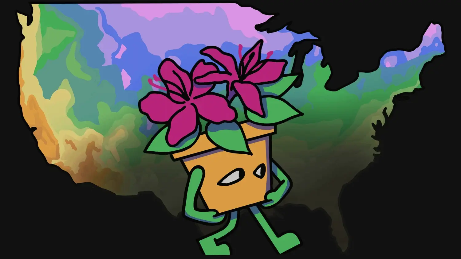
This is a tool derived from that report which directly shows how the user’s local environment has changed. Kind of trippy to see that the environment of my childhood is not the same as the environment I’m living in now. It’s a good educational tool.
Agreed. My issue is with NPR’s breathless headline and pretending that this is “news.”
“These things changed, here’s the details” is a pretty tame headline, what’s the problem?
Love your handle, by the way.
That’s not how I read the headline. Given that this story is so old (months and months), if it’s newsworthy at all today, it should be “USDA Finally Updates Climate Maps for the First Time in a Decade.”
Anyone who needs them has been paying attention to the climate for years. It’s a neat bit of science reporting, but it’s hardly “Here’s What Suddenly Changed.”
I see what you’re saying. I wasn’t aware that the USDA had updated the zones, so that was news to me at least. The appsite they built is neat. It does actually drive home that this is abnormal and will continue to accelerate in the future at least.
Fair points. The site didn’t work in my browser, but it seemed like a cool idea. I’m glad it works.
In fairness, I’m probably just snarky because I expect a different standard from NPR.