@boem@lemmy.world to Technology@lemmy.worldEnglish • 6 months ago40% of US electricity is now emissions-freearstechnica.comexternal-linkmessage-square224fedilinkarrow-up1933arrow-down122cross-posted to: news@lemmy.worldhackernews@lemmy.smeargle.fanshackernews@derp.fooworldnews@lemmy.mlclimate@slrpnk.netscience@lemmy.world
arrow-up1911arrow-down1external-link40% of US electricity is now emissions-freearstechnica.com@boem@lemmy.world to Technology@lemmy.worldEnglish • 6 months agomessage-square224fedilinkcross-posted to: news@lemmy.worldhackernews@lemmy.smeargle.fanshackernews@derp.fooworldnews@lemmy.mlclimate@slrpnk.netscience@lemmy.world
minus-squareGhostalmedialinkfedilinkEnglish5•6 months ago The article doesn’t do a good job of explaining the 40% I thought the chart was pretty clear. Although I guess they could’ve color coded it.
minus-square@assassin_aragorn@lemmy.worldlinkfedilinkEnglish6•6 months agoI think color coding it would’ve helped a bit yeah. Especially if they used the same color for wind and hydro and solar and nuclear. Otherwise you read 40% in the headline and the first thing which draws your attention is 44% natural gas
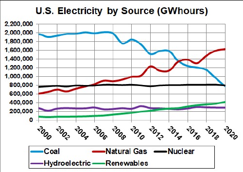
minus-square@Overshoot2648@lemm.eelinkfedilinkEnglish2•edit-26 months agoHere’s some overtime graphs up to 2020:
minus-square@Overshoot2648@lemm.eelinkfedilinkEnglish2•6 months agoHere’s some overtime graphs up to 2020:


I thought the chart was pretty clear. Although I guess they could’ve color coded it.
I think color coding it would’ve helped a bit yeah. Especially if they used the same color for wind and hydro and solar and nuclear. Otherwise you read 40% in the headline and the first thing which draws your attention is 44% natural gas
Here’s some overtime graphs up to 2020:
Here’s some overtime graphs up to 2020: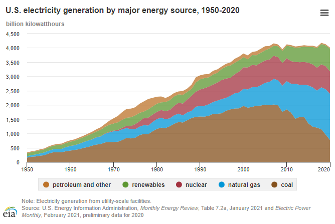
deleted by creator