

- cross-posted to:
- uiux@programming.dev
- cross-posted to:
- uiux@programming.dev
I need it now.
I’m not a designer, but I can appreciate thoughtful explanations from passionate people, and I very much enjoyed watching her walk through her thought process.
Further, I find steam to be incredibly clunky, and I’d love to see them adopt her design.
You must log in or register to comment.
Been using Steam since its debut and while I don’t like 100% of this, good lord it’s nice seeing someone actually trying.
I would absolutely love this as a starting point.
For all Gaben’s MS/Windows angst, its long term bloat and mishmash of design language/features (he’s not wrong), this really does illustrate the need for Gaben to get his house in order.
10/10 would support
Can you still do custom Steam skins? I remember that being a feature many years ago.
nope. Got removed when they switched from Vgui to CEF
deleted by creator
Following…
I’d say I like about 60-70% of their changes.
What do you think?
Are there screenshots of the different sections? I cant watch a video rn
All in all? I don’t like it. Looks like a template taken from Soulless MoneyGrab Inc. but with some added steam elements.
Change and innovation is not bad, but while perhaps not especially beautifully, the current user interface is pretty decent in the storm that is nowadays “looks over function”-mentality.
Edit: but as others have said, it would be nice if there was some kind of theme selector so people can make their own choices, or just fine tune Big Picture mode as it already follows a more simplified and stylished theme.
Ew, YouTube… Where is piped-bot?!
Probably got lost during the 0.19 upgrade.
I watched it a while ago and while I was not on board with all the changes to the store she completely lost me with the changes to the UI outside the store.
Leave the download bar right where it is, also leave the friend list where it is. Multi monitor people actually use that stuff.
Also don’t touch the god damn library. It’s fine, good even. Not sure what she’s on about a easy “Play” button for recent games missing, it’s right there in the Library home page.
@PostWatchBot@lemy.lol
Valve needs to hire this person, my god. Love that they seem to really understand what users do with steam instead of just looking at it from miles away, removing every feature + calling it a redesign.
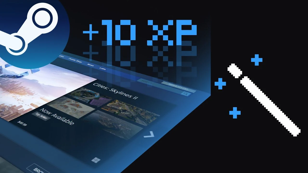
Steam’s UI has long been the worst part of using Steam for me, to the point that I actively avoid using any steam features I don’t have to. While they’ve made small parts of it prettier over time, figuring out how to do anything you haven’t done before is difficult, there’s clutter all over that makes information like reviews harder to scan, and to top it all off, every single page has a different UI I have to figure out.