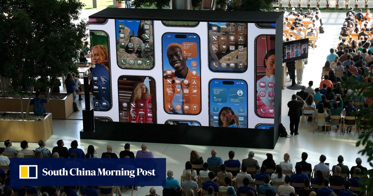
It’s not just blur though, it actually refracts what’s behind the element, which sounds more performance intensive than it needs to be, and sometimes it’s heavily distracting, but let’s not kid ourselves that this is just windows vista on a Mac, they’re emulating more of the physicalities of glass than just a static shine
I do hate color themed icons.
I understand why someone else might like it, but it makes it hard to find what I’m looking for and some of the icon designs are bland and uninspired.


Apple: adds blur effects, rounded elements, and color themeing
Homo Sapians: “Wow, another groundbreaking idea from Apple!”
It’s not just blur though, it actually refracts what’s behind the element, which sounds more performance intensive than it needs to be, and sometimes it’s heavily distracting, but let’s not kid ourselves that this is just windows vista on a Mac, they’re emulating more of the physicalities of glass than just a static shine
I do hate color themed icons. I understand why someone else might like it, but it makes it hard to find what I’m looking for and some of the icon designs are bland and uninspired.