At WWDC25, Apple announced a raft of design changes, rolling out iOS 26, iPadOS 26, macOS Tahoe 26, watchOS 26, and tvOS 26 to the delight of attending developers
I can fully see the value of “Liquid glass”, but as it stands right now it’s just a skinless ios7. And considering the weight of color codes in that design, this is a disaster
You can’t just lay out all the user’s information on space and not consolidate that space with colors or textures. Something’s just missing. It’s like saying “Hey, our alphabet is very good and we want to shake things up a bit. How about… we drop the numbers ?”
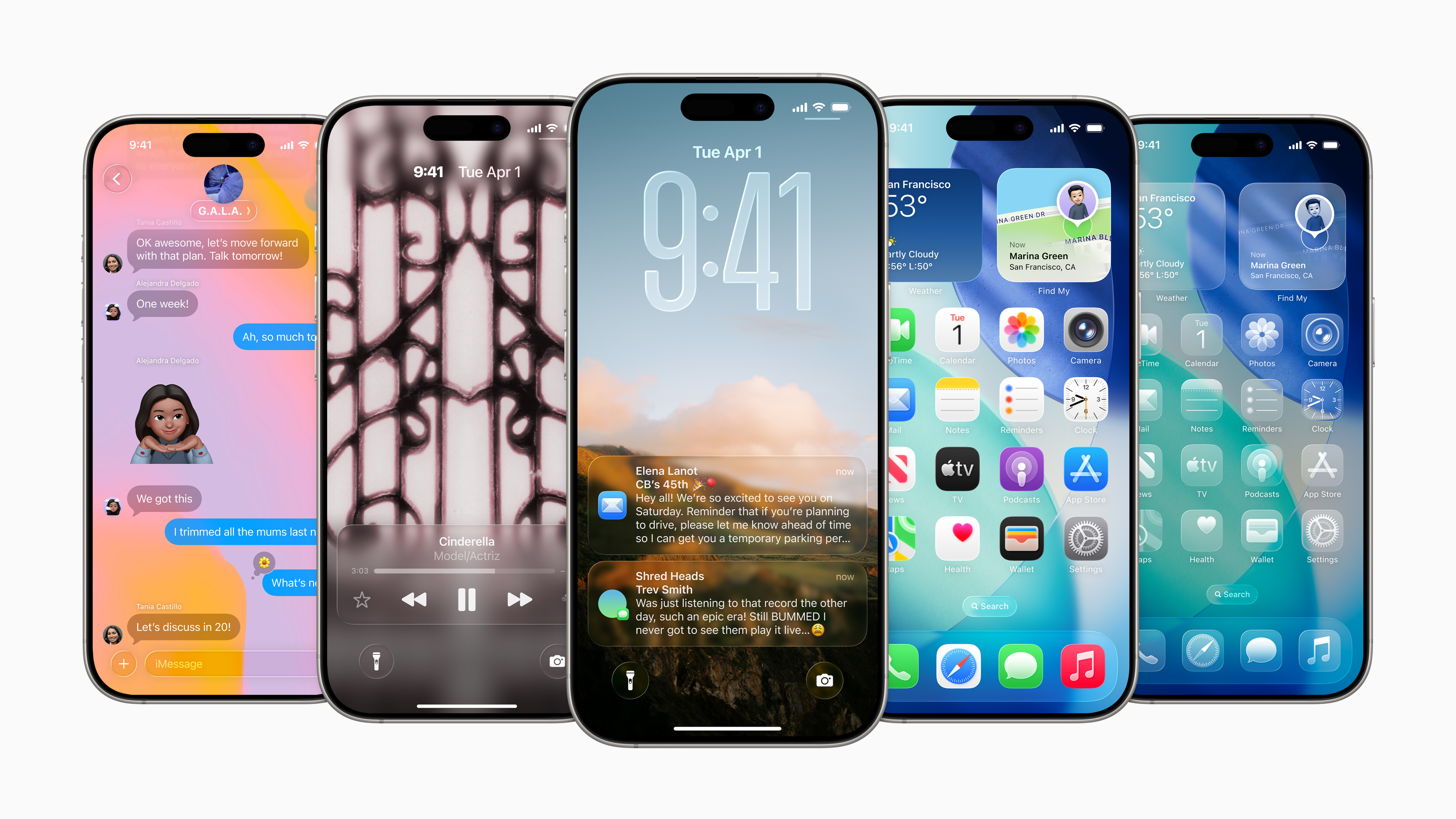
PS: ah mais j’ai répondu en anglais comme un con