

You must log in or register to comment.
I like Tsunoda’s and Hulk’s.
Is that actually Hulk’s logo? I love it lmao
Piastri’s logo is OP
Stroll straight up copying Lando
Stroll apparently used his logo in 2016 already while Lando started using his own one in 2017…
Also, it is quite different because in Lance’ case the letters are supposed to display a halfed “18” while Lando’s shows the “4” in the negative space instead.
He should have it changed to a logo featuring a silver spoon.
I posted this when the earlier versions were posted a few months ago
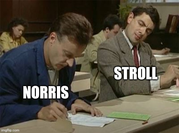
Yet still not as good as Lando’s. Lando has his number (4) in the white space, Stroll doesn’t (18).
If you squint stroll’s logo kinda represents an 18 (not in the whitespace though) , but it’s more of a 15… If they shaped the S a bit different it could have worked
Drivers have logos now? But why?
Have done for decades. Senna, Martin Brundle, Michael Schumacher, Niki Lauda are some of the notable ones. It’s the bit of branding that’s theirs, not the team or the sponsor. It’ll follow them between teams and on to their next career too.
So they can sell their own merch.
Because it’s owned by Americans now. Same reason the drivers have silly little introduction videos like they’re about to take part in fake wrestling.
They’ll have theme tunes too next season. Probably.
Looks like a Home Screen on an old blackberry.
