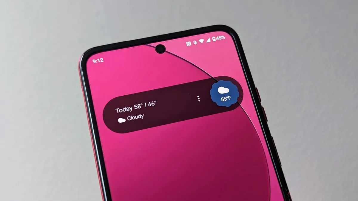
It looks hideous. Not everything needs to be a big ass pill shaped widget.
I’m getting tired of Google’s UI decisions all around and whoever sets these company wide design mandates needs fired quickly before they do even more lasting damage.
… especially the idiot behind the analogue clock design.
The Pixel can also get the new Assistant At a Glance widget, although the permanent At a Glance widget still remains in place and unchanged.
What’s the point then? I don’t need the same widget twice.
You can disable the old one in settings, so you don’t have to have it twice.
deleted by creator
Same here. I played around with the settings (extremely limited, typical of Google), but ended up just deleting the widget. I’m using Nova Launcher on a Pixel 6A. Hope it at least fits the default launcher UI better, otherwise it’s just terrible.
deleted by creator


