- cross-posted to:
- artshare@lemmy.world
- cross-posted to:
- artshare@lemmy.world
You must log in or register to comment.
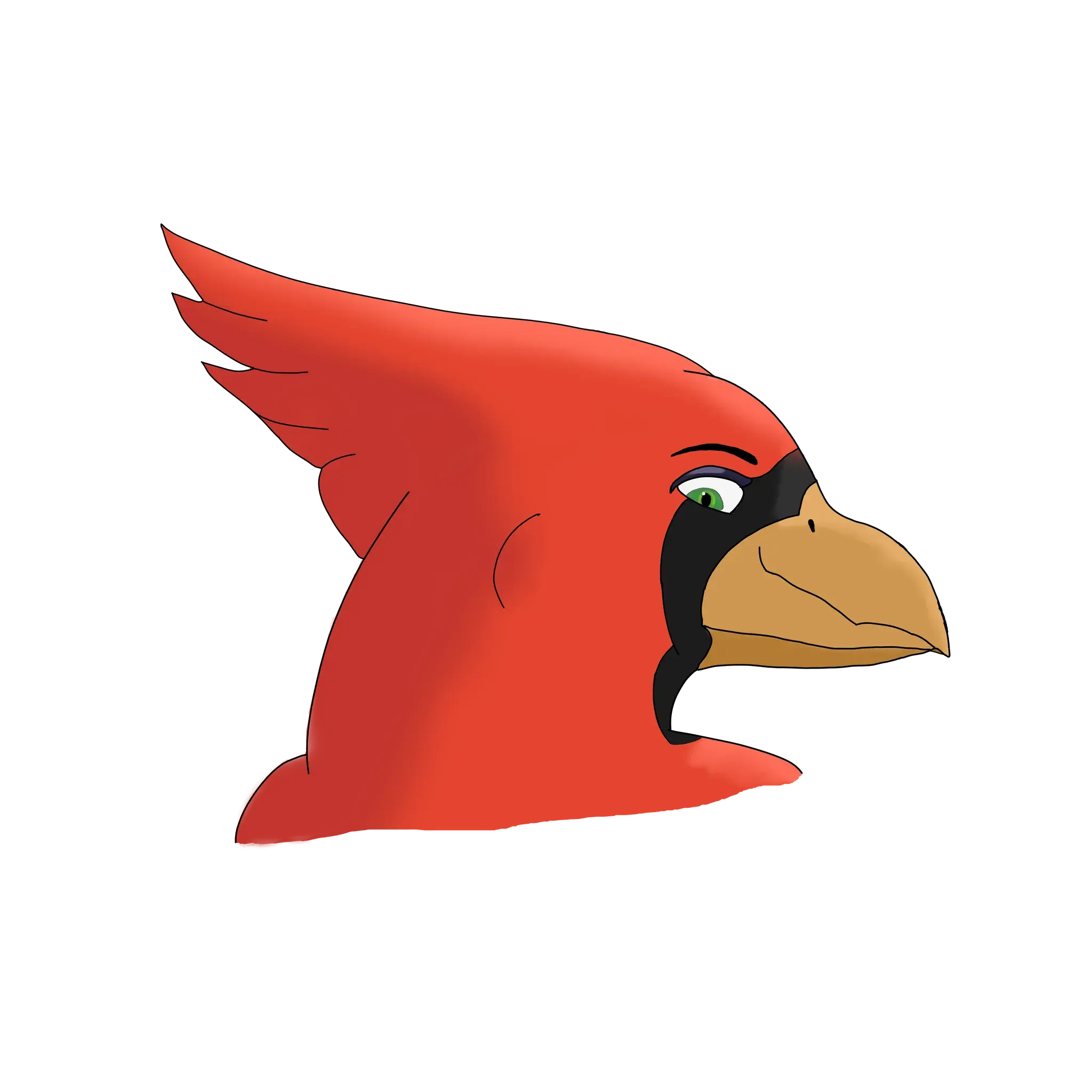
I love this angular style. It’s so unique. Keep it up.
I love that you are able to draw and not become self conscious about every single line. Non-perfect art is often the best art. <3
I like the style of more straight lines that make the whole picture round. Keep working at it!
The face looks proportional and I really like the shading of the cheeks as it gives the face a lot more depth! The left side of the hair looks good; I like how it’s colored darker than the closer right side, again it helps with perspective. The right side looks off to me for some reason, but I can’t quite put my finger on it, sorry. It looks like you’re still working on your linework, and I don’t have much useful advice there; it’s something I struggle with too.


