- cross-posted to:
- microsoft@lemdro.id
This is the best summary I could come up with:
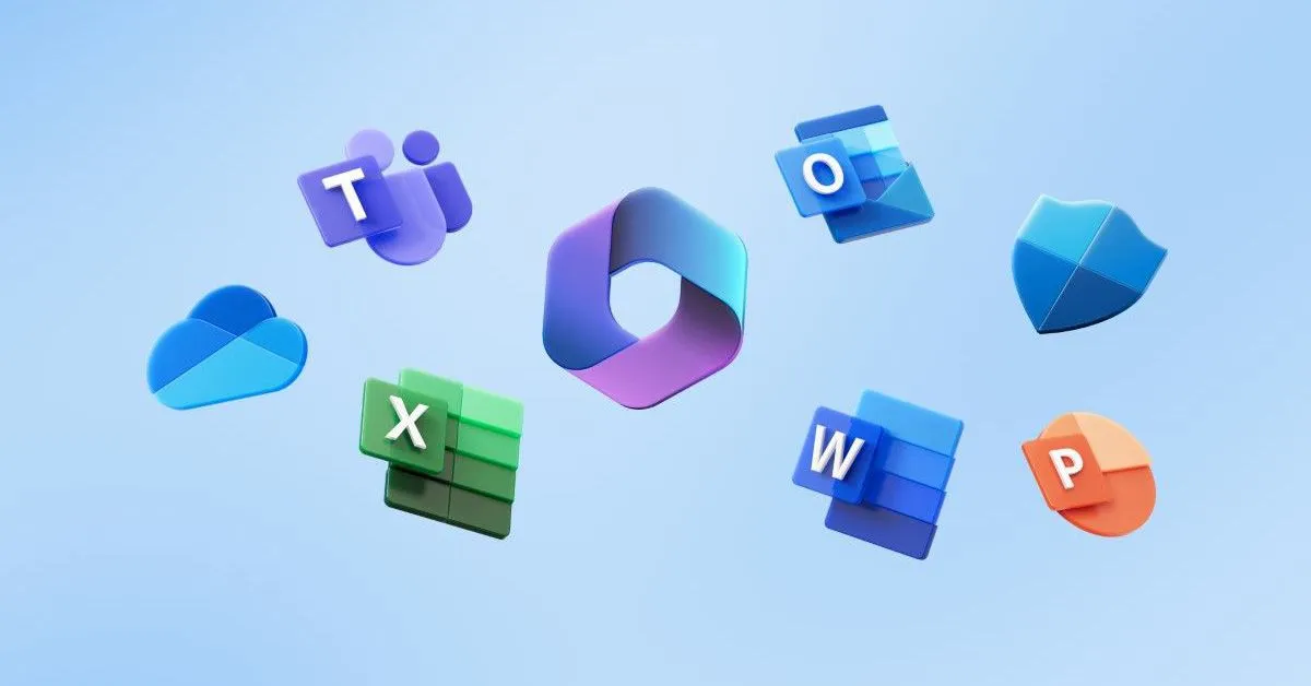
Microsoft says it’s refreshing the default Office theme with the new Aptos font, a new color palette, styles, and updated default line weights.
Aptos, the new default font for apps like Word, Outlook, PowerPoint, and Excel, will replace Calibri next month after more than 15 years.
The biggest change to the color palette is that yellow has been removed and replaced with a dark green, and one of the lighter blues has been replaced with a dark teal color.
This should result in better contrasts between the shapes and lines that are available in Office documents.
The default style in Word and Outlook is also being refreshed to “make them easy to read, look more professional, and easy to navigate,” according to Jess Kwok, a product manager for Microsoft 365 apps.
Microsoft started testing these changes with Microsoft 365 Insiders in July, and the company now says they will be rolling out to all users at some point in September.
I’m a bot and I’m open source!
My stuff has the new font already. Excel last week and today I noticed it in Outlook.
I quite like it tbh. The condensed version in Excel is pretty good. Beats calibre for sure.
The new font is fine, I guess, but I hope I can keep the old layout/design for as long as possible. The new design is just so out of place in Windows 10.


