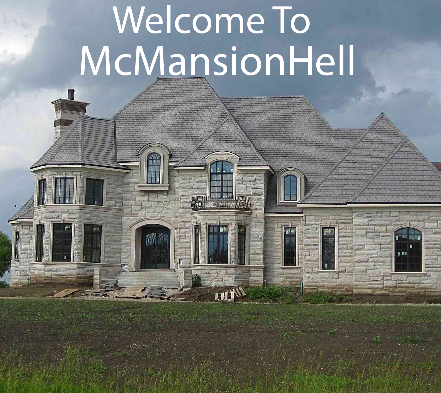
I hate when homes are built with tall ceilings but don’t fill out the space right. It feels so empty and garbage on the inside, let alone the shitty paneling on the outside with basically 0 landscaping. Yuck!
The half a Fairfield inn look
Wow, this has owner-designed written all over it.
It really does look designed by someone who doesn’t know anything about architecture. Not that I’m an architect, but they made the main living space look like a carnival fun-house and somehow made the bedrooms feel cramped even with all the storage available.
These houses are always worse on the inside. 50k to 560k in 20 years is a bit much.
Tall ceilings and narrow hallways on a new construction are a pass from me dawg. I don’t know who the architect is, but they made some poor choices.
Designed in Sims 2 I see.
I thought the same thing
There’s “open floor plan” and then there is this.


